Create line plots
Key notes !
1. Understanding the Connection Between Tables and Line Plots
- Tables: Organize data into rows and columns, making it easy to see the values and their frequencies.
- Line Plots: Visualize the data from a table on a number line, showing the frequency of each value with markers such as “X”s.
2. Steps to Create Line Plots Using Tables
- Step 1: Start with a Data Table
- Gather data and organize it into a table. Typically, the table will have two columns:
- Values: The different data points or categories.
- Frequency: How often each value occurs.
- Example:
- Gather data and organize it into a table. Typically, the table will have two columns:

- Step 2: Draw a Number Line
- Draw a horizontal line and label it with the values from the table, ensuring the range includes all data points.
- Use the values in the “Value” column of the table to label the number line.
- Step 3: Plot the Data from the Table
- For each value in the table, place “X”s above the corresponding number on the number line to represent its frequency.
- The number of “X”s should match the frequency listed in the table.
- Example: For the value 5 with a frequency of 5, place five “X”s above the number 5 on the line plot.
- Step 4: Title and Label the Line Plot
- Write a clear title that describes the data being represented.
- Ensure that the number line is correctly labeled, and the markers accurately reflect the data from the table.
3. Example
- Given Table

- Line Plot Creation:

- Final Plot:
- Title: “Distribution of Values from the Table”
- Markers above the number line representing the frequency of each value.
4. Importance of Creating Line Plots from Tables
- Visual Representation: Line plots provide a visual way to see the distribution of data, making it easier to identify patterns, trends, and outliers.
- Data Interpretation: Converting tables into line plots helps students interpret data more effectively by visualizing the frequency of each value.
- Comparison: Line plots allow for easy comparison of different data points, helping students analyze the data.
5. Common Mistakes to Avoid
- Incorrect Frequency: Ensure the number of markers (“X”s) matches the frequency listed in the table.
- Mislabeling the Number Line: Label the number line correctly to reflect all values in the table.
- Forgetting the Title: Always include a descriptive title for the line plot to clarify what data is being represented.
6. Practical Tips
- Use a ruler to draw a straight and accurate number line.
- Double-check the table data to ensure correct plotting.
- Start with simple data sets to practice before moving on to more complex data.
7. Applications
- Line plots are useful in a variety of contexts, including math, science, and social studies, to display small sets of data clearly.
- They are particularly helpful for showing the frequency of occurrences and spotting trends in the data.
Learn with an example
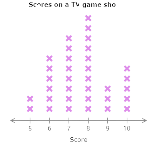
🛰️ Convinced that she could do well as a competitor, Ella tracked the scores on a TV game show over the course of a week.
Use the data in the table to complete the line plot below.

Click to select the X’s. To clear a column, click on the number line below it.
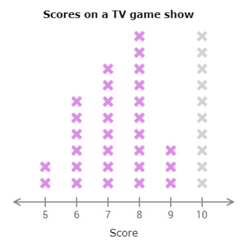
The first missing piece of data is for 10. Find the row for 10 in the table. 5 people scored 10. Select 5 X’s in the column above 10.
🛰️ Gudivada will decide whether to extend its public pool’s hours by looking at the number of times its residents visited the pool last month.
Use the data in the table to complete the line plot below.
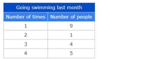
Click to select the X’s. To clear a column, click on the number line below it.
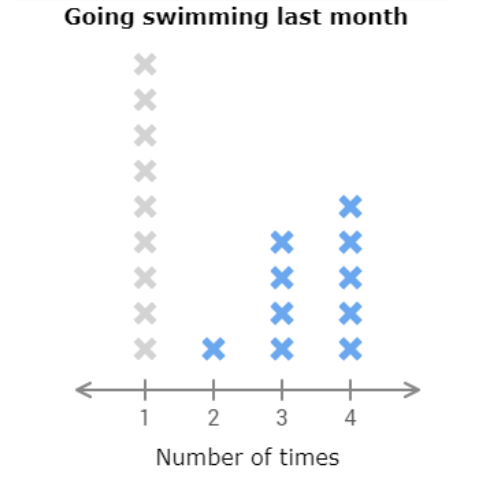
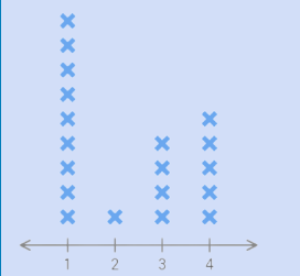
The first missing piece of data is for 1. Find the row for 1 in the table. 9 people went swimming exactly once last month. Select 9 X’s in the column above 1.
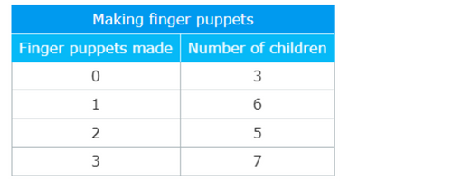
🛰️ The Bellaguntha Art Museum recorded how many finger puppets the children made at last Sunday’s art workshop.
Use the data in the table to complete the line plot below.
Click to select the X’s. To clear a column, click on the number line below it.
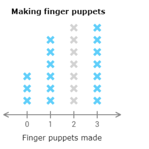
The first missing piece of data is for 2. Find the row for 2 in the table. 5 children made exactly 2 finger puppets. Select 5 X’s in the column above 2.

let’s practice!

