Create line graphs
Key notes :
Definition of Line Graphs:
- A line graph is a type of chart that displays data as a series of points connected by straight line segments. It is used to show how data changes over time or other continuous intervals.

Components of a Line Graph:
- X-axis (Horizontal Axis): Represents the independent variable, such as time or categories.
- Y-axis (Vertical Axis): Represents the dependent variable, which is the data being measured.
- Title: Describes the content or purpose of the graph.
- Labels: Clearly identify each axis with what they represent (units should be included).
- Data Points and Lines: Plot points at the intersections of x and y values, then connect these points with straight lines.
Steps to Create a Line Graph:
- Step 1: Gather Data: Collect accurate and relevant data points to be plotted.
- Step 2: Choose Appropriate Axes: Decide which variable will go on the x-axis and which on the y-axis.
- Step 3: Determine Scale: Divide the axes into appropriate intervals to accommodate all data points.
- Step 4: Plot Data Points: Place a dot at each data point’s intersection on the graph.
- Step 5: Draw Lines: Connect the dots with straight lines to show trends over time or intervals.
Interpreting Line Graphs:
- Trends: Look for patterns or trends in the data, such as increases, decreases, or fluctuations.
- Relationships: Understand how changes in one variable affect another.
- Comparisons: Compare multiple lines on the same graph to draw conclusions about relationships between different sets of data.
Examples :

graph :

Learn with an example
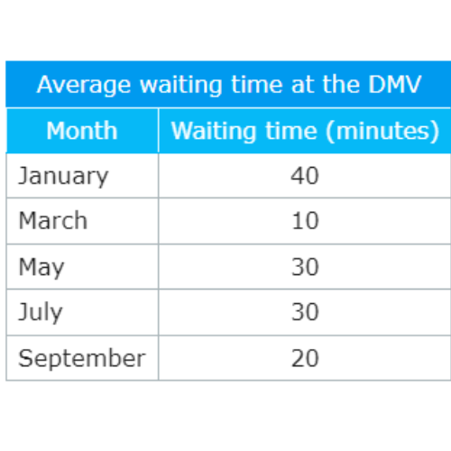
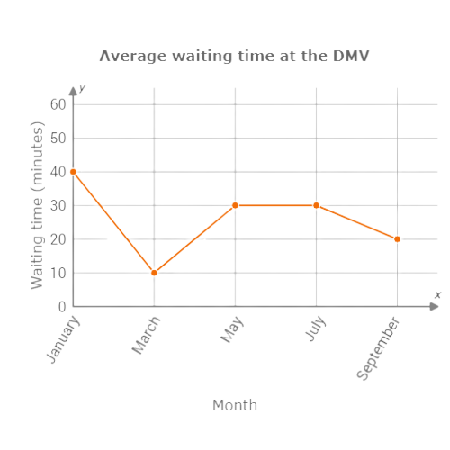
🗼 An administrator at the Department of Motor Vehicles (DMV) tracked the average wait time from month to month.
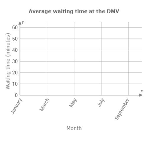
Use the data in the table to complete the line graph below.
Click to select points on the graph.
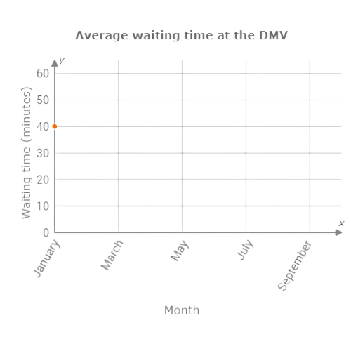
Look at the first line of the table. The first data point is for January. In January, the average waiting time was 40 minutes. Above January, click on the line for 40.
Now look at the second line of the table. The second data point is for March. In March, the average waiting time was 10 minutes. Above March, click on the line for 10.
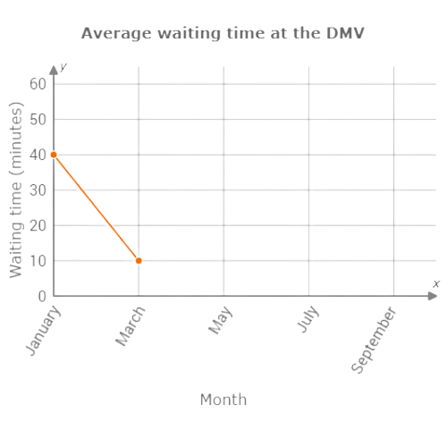
Fill in the rest of the graph the same way.
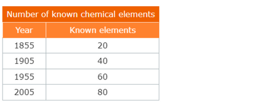
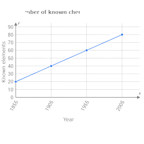
🗼 Dr. Green, a science historian, marvelled at the growing number of chemical elements discovered in modern times.
Use the data in the table to complete the line graph below.
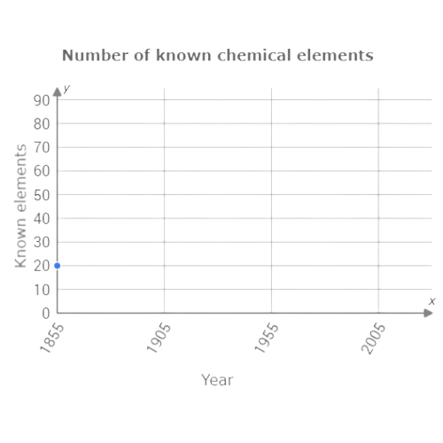
Click to select points on the graph.

Look at the first line of the table. The first data point is for 1855. In 1855, there were 20 known chemical elements. Above 1855, click on the line for 20.
Now look at the second line of the table. The second data point is for 1905. In 1905, there were 40 known chemical elements. Above 1905, click on the line for 40.
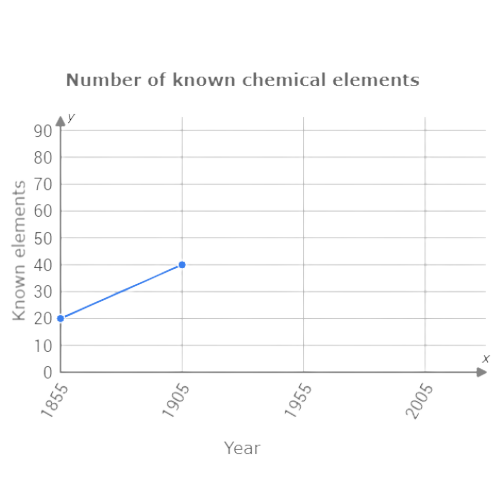
Fill in the rest of the graph the same way.
🗼 The manager of Erin’s Cafe counted cups of coffee sold each day to determine the right quantity of coffee beans to roast.
Use the data in the table to complete the line graph below.
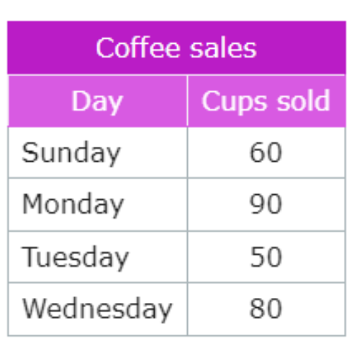
Click to select points on the graph.
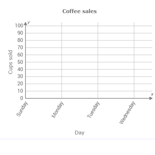
Look at the first line of the table. The first data point is for Sunday. 60 cups of coffee were sold on Sunday. Above Sunday, click on the line for 60.
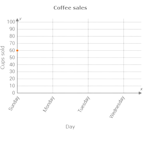
Now look at the second line of the table. The second data point is for Monday. 90 cups of coffee were sold on Monday. Above Monday, click on the line for 90.
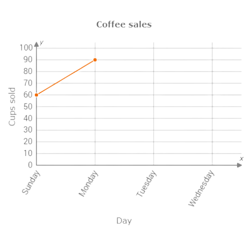
Fill in the rest of the graph the same way.
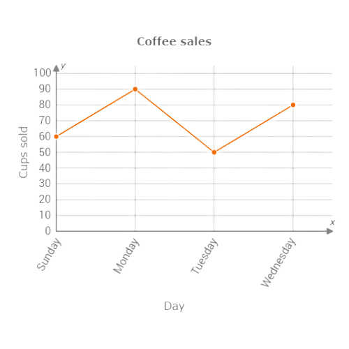
let’s practice!

