Create bar graphs
key notes:
Definition :
- A bar graph is a visual representation of data where individual bars represent the frequency or value of different categories.
- Purpose: Bar graphs make it easy to compare different sets of data visually.
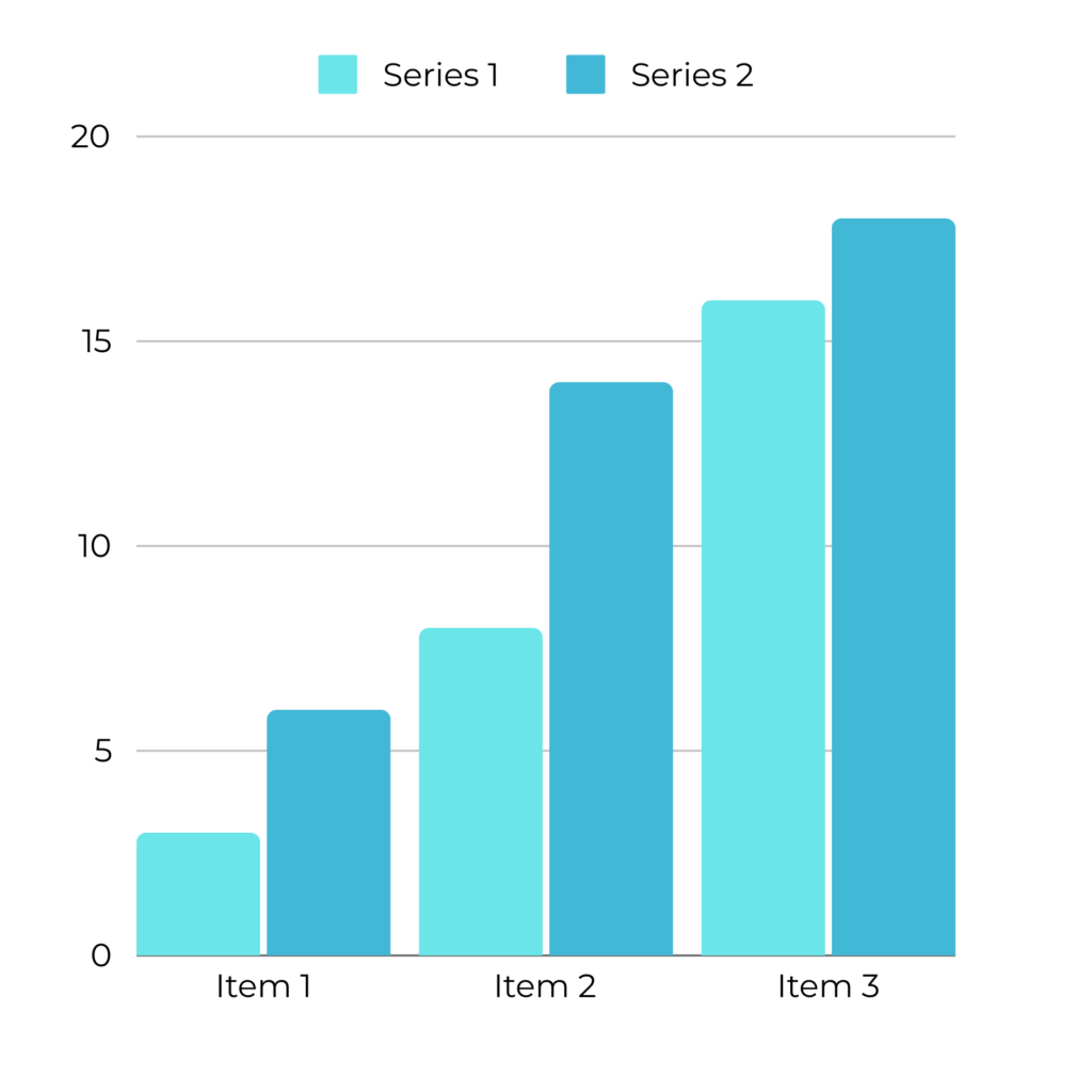
Components of a Bar Graph
- Title: Describes what the bar graph is about.
- Axes:
- X-Axis (Horizontal Axis): Typically shows the categories being compared (e.g., types of fruits, days of the week).
- Y-Axis (Vertical Axis): Shows the scale, representing the frequency or value of the data (e.g., number of students, sales in dollars).
- Bars: Rectangular blocks representing the data for each category. The height (or length) of the bar corresponds to the value on the Y-axis.
- Labels: Text on the X-axis and Y-axis to explain what the bars and scales represent.
- Scale: The set of numbers on the Y-axis that help determine the value of each bar.
Steps to Interpret a Bar Graph
Step 1: Read the Title
- Start by reading the title to understand what the graph is about.
Step 2: Analyze the Axes
- Identify what the X-axis and Y-axis represent. The X-axis usually represents categories, while the Y-axis shows the quantity or frequency.
Step 3: Examine the Bars
- Look at the height (or length) of each bar. The higher or longer the bar, the greater the value it represents.
- Compare the bars to see which categories have the highest and lowest values.
Step 4: Check the Scale
- Ensure you understand the scale on the Y-axis to accurately interpret the values that each bar represents.
Step 5: Draw Conclusions
- Determine which category has the highest and lowest value.
- Identify trends or patterns, such as whether the values are increasing or decreasing across the categories.
Types of Bar Graphs
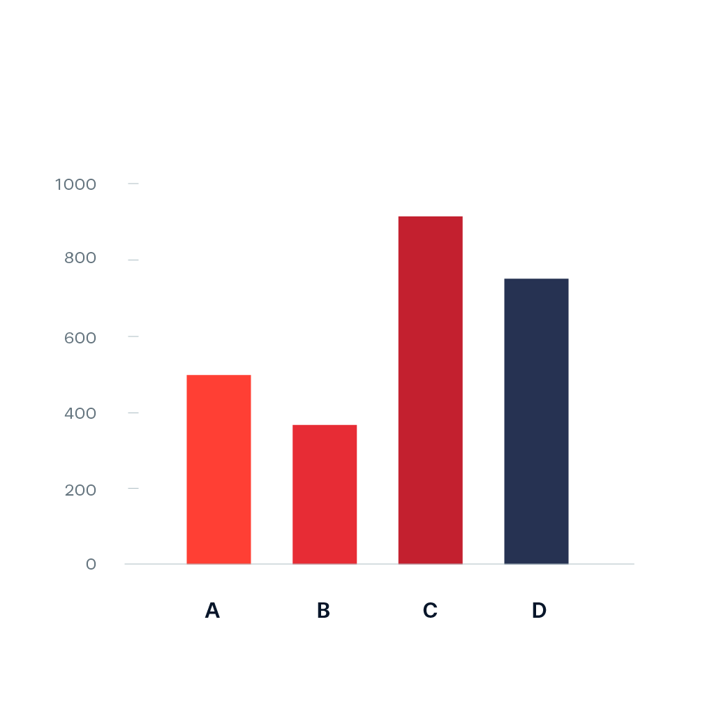
- Vertical Bar Graph: Bars are displayed vertically from the X-axis. Commonly used to compare different categories.
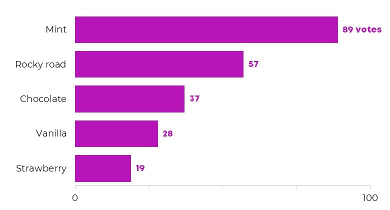
- Horizontal Bar Graph: Bars are displayed horizontally from the Y-axis. Useful when category names are long.
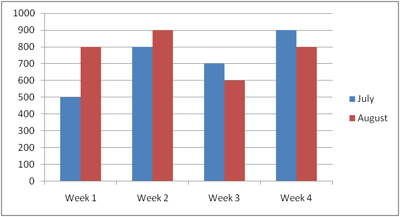
- Double Bar Graph: Displays two sets of bars for each category, allowing comparison between two data sets (e.g., comparing sales from two different years).
Example of a Bar Graph
Title: Favorite Fruit Among Students
X-Axis: Types of Fruit (Apple, Banana, Orange, Grapes)
Y-Axis: Number of Students
Bars:
- Apple: 10 students
- Banana: 15 students
- Orange: 8 students
- Grapes: 12 students

- Conclusion: Banana is the most popular fruit, while Orange is the least popular.
Benefits of Using Bar Graphs
- Easy Comparison: Bar graphs make it simple to compare the values of different categories.
- Visual Clarity: The differences in bar height or length clearly show the differences in values.
- Quick Analysis: Provides a snapshot view of data, making it easier to spot trends and patterns.
Common Mistakes to Avoid
- Ignoring the Scale: Make sure to understand the scale on the Y-axis, as it affects how you interpret the height or length of the bars.
- Overlooking Axis Labels: Always check the labels on both axes to know what the bars represent.
- Misinterpreting the Bar Height: Remember that the bar height or length directly correlates with the value on the Y-axis, not the category on the X-axis.
Learn with an example
The technical support line received 60 calls on Sunday, 40 calls on Monday, 30 calls on Tuesday, 60 calls on Wednesday and 60 calls on Thursday.
Use this data to complete the bar graph below.
Click to set the height of the missing bar.
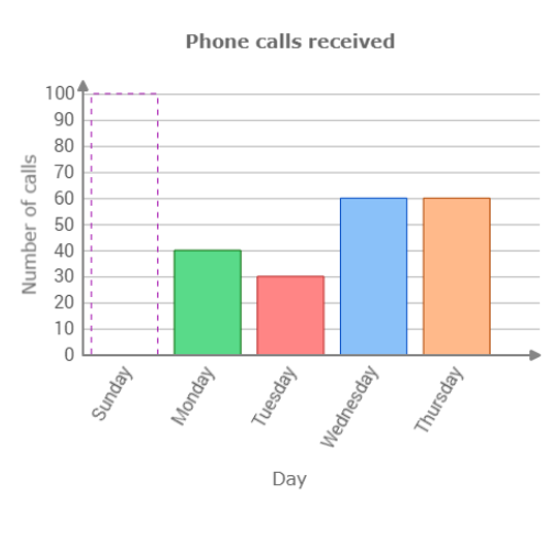
The missing bar is for Sunday. Set the height of the missing bar to 60.

A nutritionist designing a healthy lunch menu asked students at Udma Primary School to vote for their favourite fruits.
Use the data in the table to complete the bar graph below.
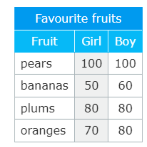
Click to set the height of the missing bar.
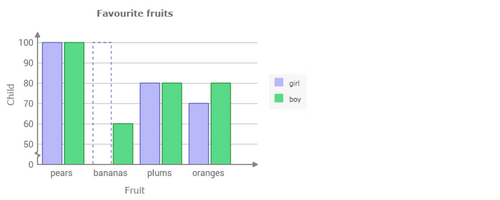
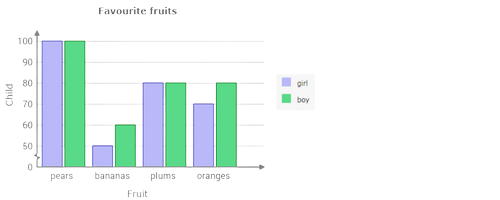
In the table, find the bananas row. Find the number in the girl column. 50 girls voted for bananas. Set the height of the missing bar to 50.
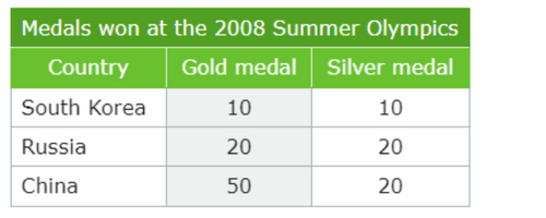
A television station announced the medal counts from the 2008 Summer Olympics.
Use the data in the table to complete the bar graph below.
Click to set the height of the missing bar.
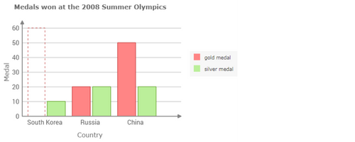
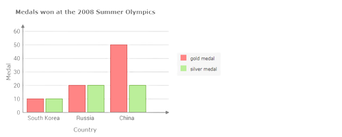
In the table, find the South Korea row. Find the number in the gold medal column. South Korea won 10 gold medals. Set the height of the missing bar to 10.
let’s practice!

