Interpret bar graphs
Key notes:
Understanding Tables
- Tables organize data into rows and columns to present information clearly.
- Each row typically represents a category or group, and each column represents a variable or attribute.
What is a Bar Graph?
- A bar graph is a visual representation of data where individual bars represent the frequency or value of different categories.
- Purpose: Bar graphs make it easy to compare different sets of data visually.
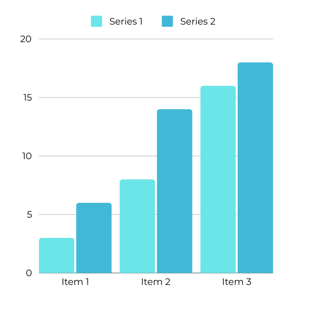
Components of a Bar Graph
Title: Describes what the bar graph is about.
Axes:
- X-Axis (Horizontal Axis): Typically shows the categories being compared (e.g., types of fruits, days of the week).
- Y-Axis (Vertical Axis): Shows the scale, representing the frequency or value of the data (e.g., number of students, sales in dollars).
Bars: Rectangular blocks representing the data for each category. The height (or length) of the bar corresponds to the value on the Y-axis.
Labels: Text on the X-axis and Y-axis to explain what the bars and scales represent.
Scale: The set of numbers on the Y-axis that help determine the value of each bar.
Steps to Interpret a Bar Graph
Step 1: Read the Title
- Start by reading the title to understand what the graph is about.
Step 2: Analyze the Axes
- Identify what the X-axis and Y-axis represent. The X-axis usually represents categories, while the Y-axis shows the quantity or frequency.
Step 3: Examine the Bars
- Look at the height (or length) of each bar. The higher or longer the bar, the greater the value it represents.
- Compare the bars to see which categories have the highest and lowest values.
Step 4: Check the Scale
Ensure you understand the scale on the Y-axis to accurately interpret the values that each bar represents.
Step 5: Draw Conclusions
- Determine which category has the highest and lowest value.
- Identify trends or patterns, such as whether the values are increasing or decreasing across the categories.
Types of Bar Graphs
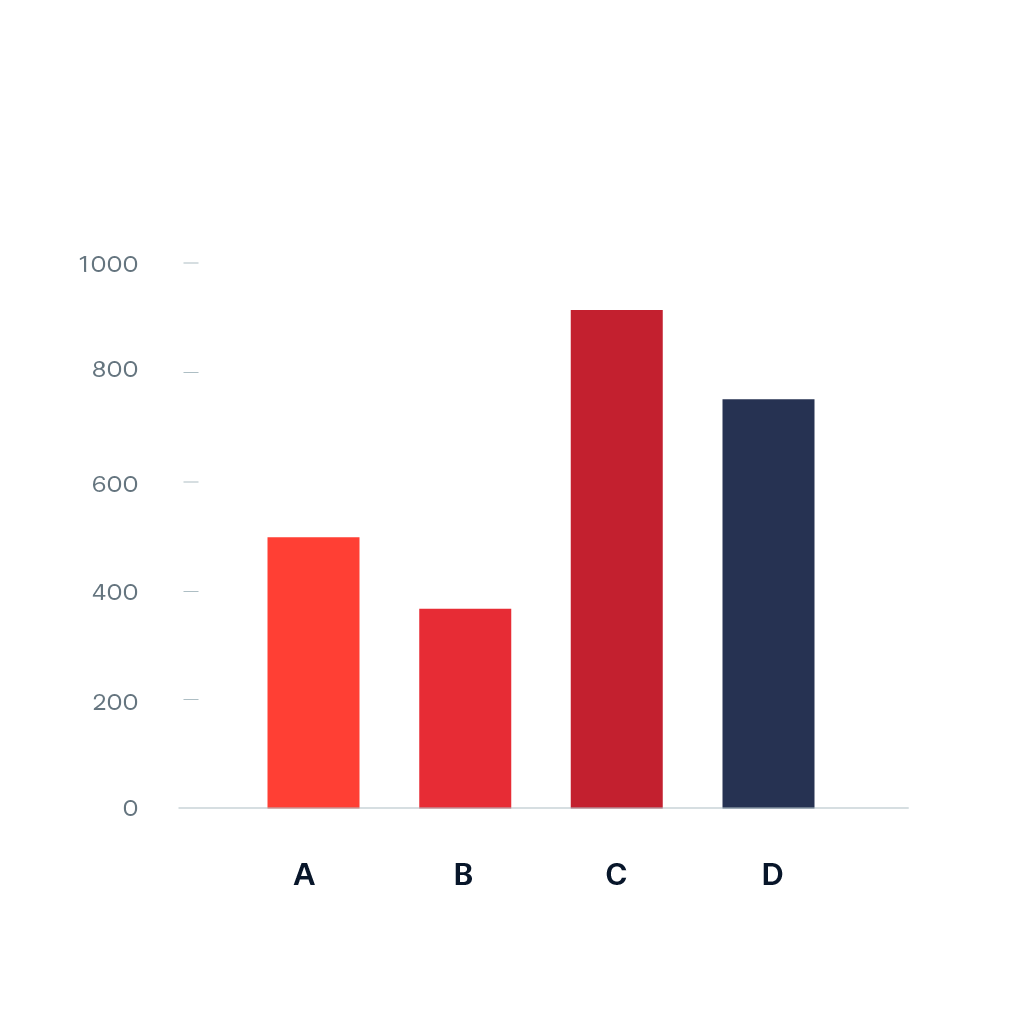
- Vertical Bar Graph: Bars are displayed vertically from the X-axis. Commonly used to compare different categories.
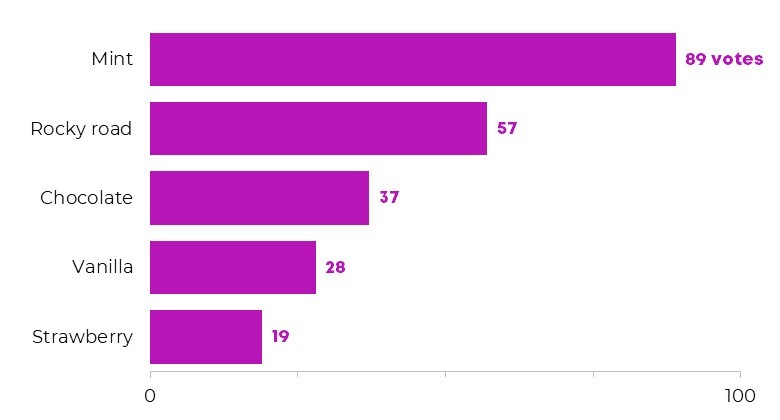
- Horizontal Bar Graph: Bars are displayed horizontally from the Y-axis. Useful when category names are long.
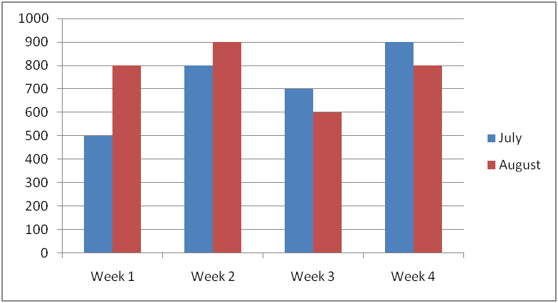
- Double Bar Graph: Displays two sets of bars for each category, allowing comparison between two data sets (e.g., comparing sales from two different years).
Example of a Bar Graph
Title: Favorite Fruit Among Students
X-Axis: Types of Fruit (Apple, Banana, Orange, Grapes)
Y-Axis: Number of Students
Bars:
- Apple: 10 students
- Banana: 15 students
- Orange: 8 students
- Grapes: 12 students

- Conclusion: Banana is the most popular fruit, while Orange is the least popular.
Benefits of Using Bar Graphs
- Easy Comparison: Bar graphs make it simple to compare the values of different categories.
- Visual Clarity: The differences in bar height or length clearly show the differences in values.
- Quick Analysis: Provides a snapshot view of data, making it easier to spot trends and patterns.
Common Mistakes to Avoid
- Ignoring the Scale: Make sure to understand the scale on the Y-axis, as it affects how you interpret the height or length of the bars.
- Overlooking Axis Labels: Always check the labels on both axes to know what the bars represent.
- Misinterpreting the Bar Height: Remember that the bar height or length directly correlates with the value on the Y-axis, not the category on the X-axis.
Learn with an example
🗼 In determining which sports to offer this season, the Belleville Community Centre asked its members’ children to vote for their favourite sports.

🗼 How many more girls than boys voted for gymnastics?——-girls.
Find the bars for gymnastics. One bar represents boys and the other bar represents girls. Read the value of each bar.
| Girls: | 80 |
| Boys: | 45 |
Now subtract:
80 − 45 = 35
35 more girls than boys voted for gymnastics.
🗼 A zoologist counted the number of reptiles at each of the state’s zoos.

🗼 Are there fewer reptiles at the Northside Zoo or the Eastern Zoo?
Eastern Zoo Northside Zoo
Find the bars for Northside Zoo and Eastern Zoo. In each pair of bars, one bar represents lizards and the other bar represents snakes. Read the numbers for each pair of bars, then add the numbers together.
| Northside Zoo: | 4 + 5 = 9 |
| Eastern Zoo: | 2 + 10 = 12 |
9 is less than 12. There are fewer reptiles at the Northside Zoo.
🗼 The transportation company tracked the number of train tickets sold in the past 4 days.
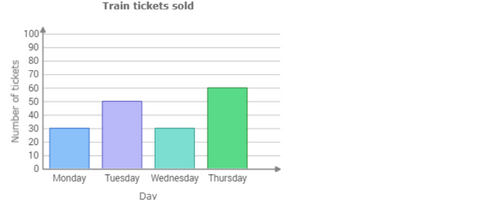
🗼 How many train tickets were sold in all on Wednesday and Thursday?—- tickets
Find the Wednesday and Thursday bars in the graph.

Use the scale on the left side of the graph to read the value of each bar.
Wednesday:30
Thursday:60
Now add:
30+60=90
90 train tickets were sold on Wednesday and Thursday.
let’s practice!

