Choose the best type of graph
Key notes !
1. Understanding Different Types of Graphs
- Bar Graph: Uses rectangular bars to compare different categories. Best for showing comparisons among discrete categories.

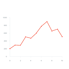
- Line Graph: Uses points connected by lines to show changes over time. Ideal for showing trends or continuous data.
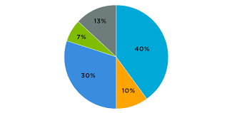
- Pie Chart: A circular chart divided into sectors that represent the proportions of a whole. Useful for showing relative sizes of parts within a whole.
- Histogram: Similar to a bar graph but used for continuous data divided into intervals. Suitable for showing frequency distributions.

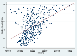
- Scatter Plot: Uses points plotted on a coordinate grid to show the relationship between two variables. Effective for showing correlations or patterns in data.
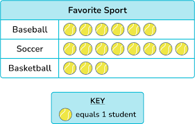
- Pictograph: Uses pictures or symbols to represent data. Good for making data visually engaging, especially for younger audiences.
2. Key Criteria for Choosing the Best Graph
- Nature of the Data: Understand whether your data is categorical, continuous, or represents parts of a whole.
- Categorical Data: Use a bar graph or pie chart.
- Continuous Data: Use a line graph, histogram, or scatter plot.
- Parts of a Whole: Use a pie chart.
- Purpose of the Graph: Consider what you want to convey with your data.
- Comparison: Use a bar graph to compare different categories.
- Trend Over Time: Use a line graph to show how data changes over time.
- Distribution: Use a histogram to show the distribution of data across intervals.
- Relationship Between Variables: Use a scatter plot to show the correlation between two variables.
- Audience: Consider who will be viewing the graph and their level of understanding.
- General Audience: Use simpler graphs like bar graphs or pie charts.
- Technical Audience: Use more detailed graphs like scatter plots or histograms.
3. Examples of When to Use Each Graph
- Bar Graph Example: Comparing the test scores of students across different subjects.
- Line Graph Example: Tracking the temperature changes over a week.
- Pie Chart Example: Showing the percentage of time spent on different activities in a day.
- Histogram Example: Displaying the distribution of students’ heights in a class.
- Scatter Plot Example: Analyzing the relationship between hours studied and exam scores.
4. Steps to Choose the Best Graph
- Analyze Your Data: Determine the type of data you have (categorical, continuous, or part of a whole).
- Determine Your Purpose: Decide what you want to illustrate with the graph (comparison, trend, distribution, etc.).
- Select the Graph Type: Choose the graph that best matches your data type and purpose.
- Consider Your Audience: Ensure the graph type is appropriate for the audience’s understanding.
5. Common Mistakes to Avoid
- Choosing the Wrong Graph: Using a pie chart for data that doesn’t represent parts of a whole can be confusing.
- Overcomplicating Data: Using a scatter plot when a simple bar graph would suffice can make the data harder to understand.
- Ignoring Data Trends: Failing to use a line graph for time-based data might obscure important trends.
6. Real-World Applications
- Business: Companies use bar graphs to compare sales across different regions, line graphs to track revenue over time, and pie charts to allocate budget percentages.
- Science: Researchers use scatter plots to show correlations between variables, such as temperature and plant growth.
Learn with an example
🖋️ Which type of graph would best show the proportion of students who walk, bike, or take the bus to school?
line graph double bar graph circle graph pictograph
The best type of graph to show the proportion of students who walk, bike, or take the bus to school is a circle graph. It shows percents, fractions, or parts of a whole. Example:

The other types of graphs are not as good.
A line graph shows a value that changes over time. Example:

A double bar graph compares two sets of data. Example:
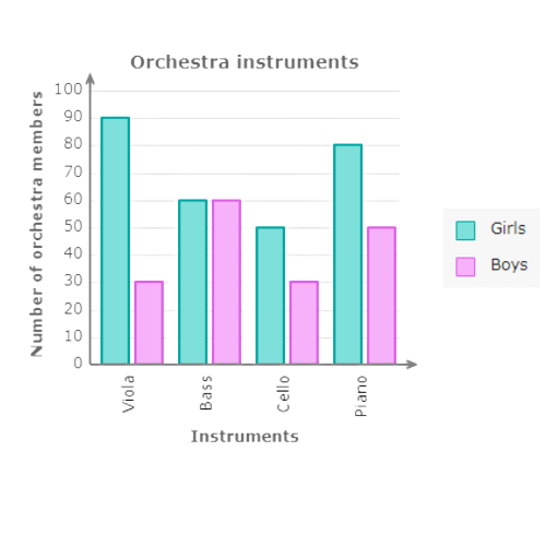
A pictograph compares two or more values that are multiples of a number. Example:

🖋️Which is the best type of graph to show the number of students who prefer each type of biscuit?
bar graph double bar graph line graph circle graph
The best type of graph to show the number of students who prefer each type of biscuit is a bar graph. It compares two or more values. Example:
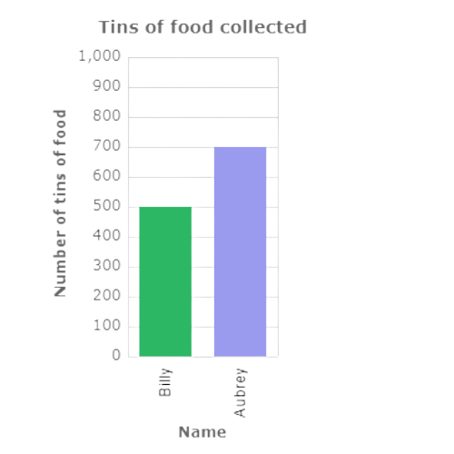
The other types of graphs are not as good.
A double bar graph compares two sets of data. Example:
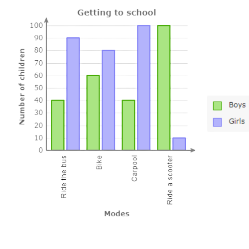
A line graph shows a value that changes over time. Example:

A circle graph shows percents, fractions, or parts of a whole. Example:

🖋️ Which is the best type of graph to show the proportion of maths, science, history, geography, and English teachers in a school?
double bar graph line graph pictograph circle graph
The best type of graph to show the proportion of maths, science, history, geography, and English teachers in a school is a circle graph. It shows percents, fractions, or parts of a whole. Example:
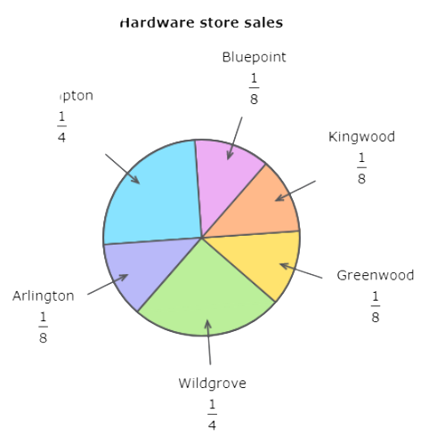
The other types of graphs are not as good.
A double bar graph compares two sets of data. Example:

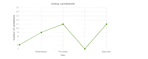
A line graph shows a value that changes over time. Example:
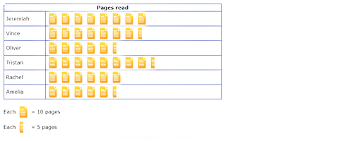
A pictograph compares two or more values that are multiples of a number. Example:
let’s practice!

