Pie charts and central angles
Key Notes:
1. Definition of a Pie Chart
- A pie chart is a circular chart divided into sectors (slices), each representing a proportion of the whole.
- The entire pie represents 100% of the data, and each sector’s size is proportional to its share of the total.

2. Components of a Pie Chart
- Circle (Whole): Represents the total dataset or 100%.
- Sectors (Slices): Each sector represents a category, showing its proportion relative to the whole.
- Labels: Each sector may be labeled with the category name and its corresponding percentage or fraction of the whole.
- Legend: Explains the categories represented by each sector, often using colors or patterns.
3. Understanding Central Angles
- Central Angle: The angle formed at the center of the pie chart by two radii (lines from the center to the edge of the circle) that define a sector.
- The size of each central angle is directly proportional to the size of the sector and the proportion of the data it represents.
- Total Central Angles: The sum of all central angles in a pie chart is 360° because the chart is a complete circle.
4. Calculating Central Angles
To calculate the central angle for each sector:
- Determine the Fraction or Percentage:
- Identify the percentage or fraction of the total that each category represents.
- Use the Formula:
- Convert the percentage to a fraction (if needed) and multiply by 360°.
- Formula: Central Angle (in degrees) = (Percentage/100) × 360°
5. Steps to Create a Pie Chart with Central Angles
- Collect Data: Gather data and determine the percentage or fraction for each category.
- Calculate Central Angles: Use the formula to calculate the central angle for each sector.
- Draw the Circle: Draw a circle representing the entire dataset.
- Draw Sectors: Starting from a fixed radius (like the 12 o’clock position), use a protractor to measure and draw each sector’s central angle.
- Label Sectors: Label each sector with its category name and the corresponding percentage or fraction.
- Add a Legend: Include a legend if necessary to clarify the categories.
6. Interpreting Pie Charts with Central Angles
- Visualizing Proportions: Larger central angles correspond to larger sectors, indicating a larger proportion of the data.
- Comparing Categories: By comparing the central angles or sector sizes, you can determine which categories are most or least significant
7. Examples and Practice
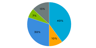
- Example 1: A pie chart representing time spent on daily activities.
- Categories: Sleep , Schoo, Homework , Leisure , Others

8. Real-World Applications
- Business: Pie charts with central angles are used in business to represent market share, budget allocations, and survey results.
- Science: Used to visualize data distributions, such as species population, energy consumption, or resource allocation.
9. Common Mistakes to Avoid
- Incorrect Angle Calculation: Ensure accurate calculations to prevent misrepresentation of data.
- Overlapping Sectors: Ensure that the sum of the central angles equals 360° to avoid overlapping or gaps between sectors.
Learn with an example
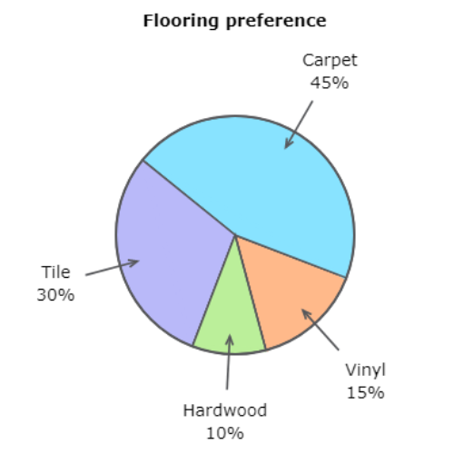
🖍️ Melton’s Flooring sponsored a survey about home flooring preferences.

🖍️ What is the measure of the central angle in the “Vinyl” section?
——–°
According to the graph, 15% of the respondents preferred vinyl flooring.
Find 15% of 360°.
15% of 360°=0.15* 360°
=54°
In the “Vinyl” section, the measure of the central angle is 54°.
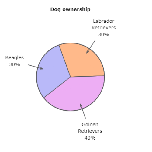
🖍️ Arcadia requires all dogs to be registered with the city and keeps records of the distribution of different breeds.

🖍️ What is the measure of the central angle in the “Labrador Retrievers” section?
—————-°
According to the graph, 30% of dogs registered with the city are Labrador Retrievers.
Find 30% of 360°.
30% of 360°=0.30*360°
=108°
In the “Labrador Retrievers” section, the measure of the central angle is 108°.
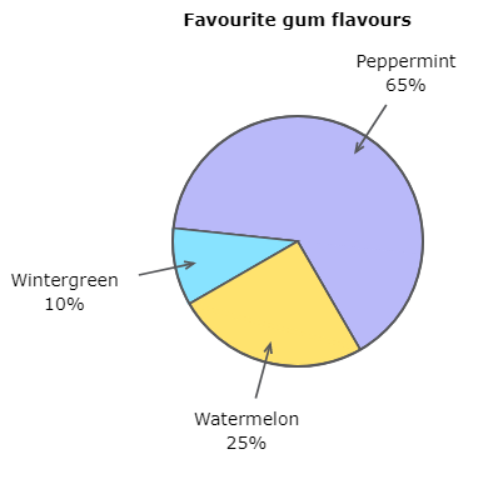
🖍️ The visitors to a certain website were interviewed about their favourite gum flavours.

🖍️ What is the measure of the central angle in the “Peppermint” section?
——–°
According to the graph, 65% of people chose “Peppermint”.
Find 65% of 360°.
65% of 360°=0.65× 360°
=234°
In the “Peppermint” section, the measure of the central angle is 234°.
let’s practice!

