Interpret pie charts
Key notes !
1.Definition of a Pie Chart
- A pie chart is a circular chart divided into slices or sectors, where each slice represents a proportion of the whole.
- Pie charts are used to show the relative sizes of data categories as parts of a whole, often in percentages.

2. Components of a Pie Chart
- Circle (Whole): Represents the entire dataset or 100% of the data.
- Slices (Sectors): Each slice corresponds to a category in the dataset, showing its proportion relative to the whole.
- Labels: Each slice may have a label that names the category it represents and may include the percentage or value of that category.
- Legend: A key that explains the colors or patterns used in the slices, corresponding to different categories.
3. How to Interpret a Pie Chart
- Identify the Whole: Understand what the entire pie represents (e.g., total sales, population, survey responses).
- Read the Labels and Legend: Use labels and the legend to identify what each slice represents.
- Compare Slices: Observe the size of each slice relative to others to determine which categories are larger or smaller.
- Calculate Percentages: If not provided, you can estimate the percentage of each slice by comparing it to the entire pie. Remember that the entire pie represents 100%.
- Draw Conclusions: Based on the size of the slices, determine the most significant or least significant categories.
4. Steps to Analyze a Pie Chart
- Examine the Title: The title provides context about what the pie chart represents.
- Identify Each Category: Look at the legend or labels to understand what each slice stands for.
- Estimate the Size of Each Slice: Visually compare the sizes of slices. Larger slices represent larger proportions of the whole.
- Look for Major and Minor Slices: Identify which categories dominate the pie chart and which are less significant.
- Interpret the Data: Consider what the data tells you about the distribution of the categories. Are there any surprising or expected findings?
5. Examples and Practice
- Example 1: A pie chart showing the favorite sports of students in a class.
- The pie chart might show categories like Football, Basketball, Cricket, etc., with slices representing the percentage of students who prefer each sport.
- Interpretation: If the slice for Football is the largest, it indicates that most students prefer Football.

- Example 2: A pie chart showing the budget allocation for a school event.
- Categories might include Food, Decorations, Entertainment, and Prizes.
- Interpretation: The slice representing the largest portion of the pie shows where most of the budget is allocated.

6. Common Misinterpretations to Avoid
- Overlooking Small Slices: Even small slices can be significant, especially if they represent important categories.
- Ignoring Proportions: Remember that the size of the slice represents the proportion relative to the whole. Don’t assume that all slices are equal.
- Misreading Labels: Ensure that you correctly associate slices with their corresponding categories using the legend or labels.
Learn with an example
🖊️ Weston requires all dogs to be registered with the city and keeps records of the distribution of different breeds.
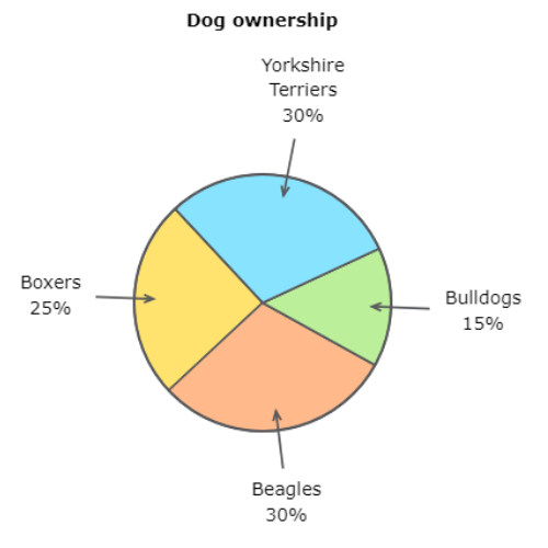
🖊️ If 100 dogs are registered, how many of them are Bulldogs?
——Bulldogs.
Find the percentage of dogs that are Bulldogs.
15% of the dogs are Bulldogs.
Find 15% of 100. Write 15% as the decimal 0.15. Now multiply 100 by 0.15.
100 × 0.15 = 15
15 dogs are Bulldogs.
🖊️ The members of an eighth-grade class were asked about their favourite art projects.
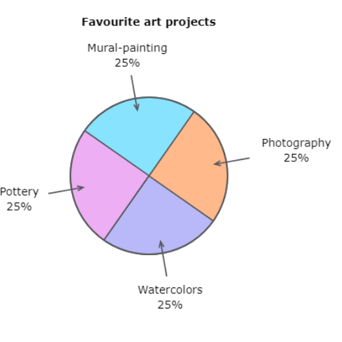
🖊️ If 60 people were surveyed, how many people voted for mural-painting?
——-people.
Find the percentage of people who voted for mural-painting.
25% of the people voted for mural-painting.
Find 25% of 60. Write 25% as the decimal 0.25. Now multiply 60 by 0.25.
60 × 0.25 = 15
15 people voted for mural-painting.
🖊️ Owen recently emptied his coin jar and counted the coins.
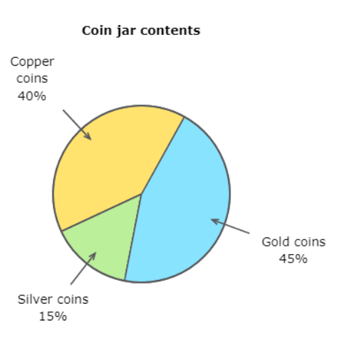
🖊️ Which coin did Owen have the fewest of?
copper coins silver coins gold coins
Look for the smallest section in the graph. The smallest section is for silver coins. Owen had the fewest silver coins.
let’s practice!