Create histograms
Key notes !
1. Understanding Histograms
- A histogram is a type of bar graph that represents the distribution of numerical data by showing the frequency of data points within specified intervals (bins).
- Unlike bar graphs, histograms display data that is continuous, meaning the bars touch each other.
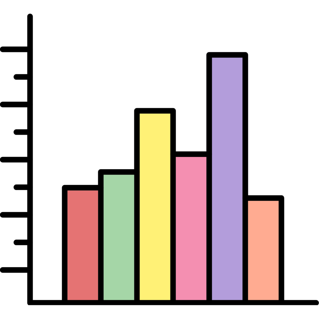
2. Parts of a Histogram
- Title: Describes what the histogram represents.
- X-axis (Horizontal axis): Represents the intervals or bins of data, showing the range of values grouped together.
- Y-axis (Vertical axis): Represents the frequency or count of data points within each interval.
- Bars: Each bar represents the frequency of data points within a specific interval. The height of the bar corresponds to how many data points fall within that interval.
3. Steps to Interpret a Histogram
- Step 1: Read the Title: Understand what the histogram is about.
- Step 2: Analyze the X-axis: Look at the intervals to understand the range of data being represented.
- Step 3: Analyze the Y-axis: Check the scale to understand the frequency of data points.
- Step 4: Examine the Bars: The height of each bar indicates how many data points fall within the corresponding interval.
- Step 5: Draw Conclusions: Use the histogram to identify patterns, such as which interval has the most or least data points.
4. Identifying Key Features in Histograms
- Peak (Mode): The tallest bar represents the interval with the highest frequency, also known as the mode.
- Spread: Look at how wide the data is spread across the intervals. This shows the range of the data.
- Skewness:
- Left-skewed (negative skew): Most data points are concentrated on the right side.
- Right-skewed (positive skew): Most data points are concentrated on the left side.
- Symmetrical: Data is evenly distributed on both sides of the peak.
5. Comparing Histograms
- Compare different histograms by looking at the spread, peak, and skewness to understand how the distributions differ.
- Compare the height of bars in different histograms to see which data set has more frequent values within certain intervals.
6. Common Mistakes to Avoid
- Misinterpreting the intervals: Remember that each bar represents the frequency of data within a specific interval, not individual values.
- Confusing histograms with bar graphs: Unlike bar graphs, the bars in histograms touch because the data is continuous.
7. Applications of Histograms
- Histograms are often used in statistics to display the distribution of data points, such as test scores, temperatures, or any other quantitative data.
- They help in identifying the central tendency, spread, and overall shape of the data distribution.
Learn with an example
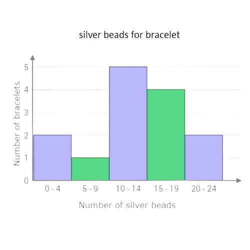
🛰️ Amy counted the number of silver beads on each bracelet at Adalaj Jewellery, the store where she works.
Use the data to complete the histogram below.
Silver beads per bracelet
1 1 8 10 11 12 13 14 15 15 16 18 23 24
Click to set the height of the missing bar.
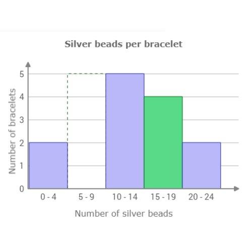
The missing bar is for the range 5 – 9 silver bead. Count the number of values in this range. 1 bracelet had between 5 and 9 silver beads. Set the height of the bar to 1.
🛰️ The receptionist at a doctor’s office kept track of each patient’s wait time.
Use the data to complete the histogram below.
Doctor’s office wait times (minutes)
1 2 15 16 17 21 22 27 36 38 50 60 66 75 80 97
Click to set the height of the missing bar.

The missing bar is for the range 61 – 80 minutes. Count the number of values in this range. 3 people waited for between 61 and 80 minutes. Set the height of the bar to 3.

🛰️ Catherine counted the number of ducks at each pond in the city.
Use the data in the table to complete the histogram below.
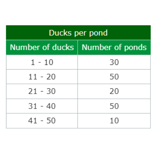
Click to set the height of the missing bar.
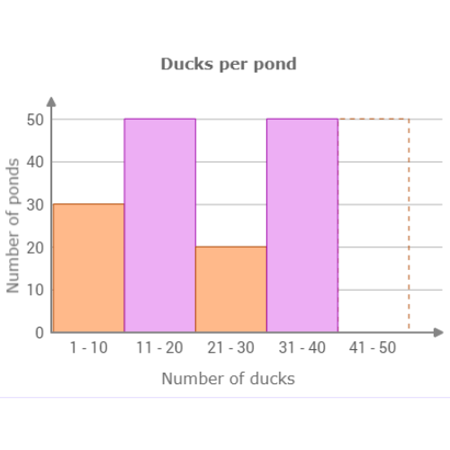
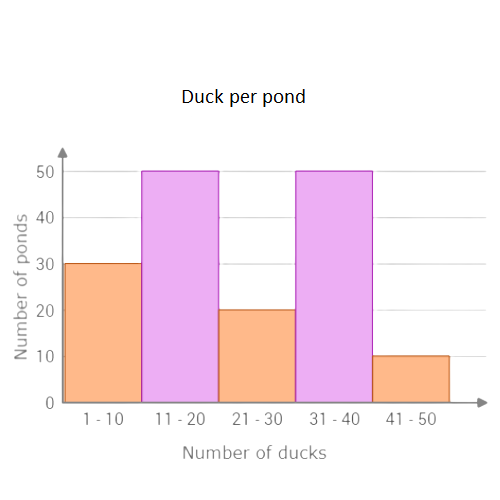
The missing bar is for the range 41 – 50 ducks. 10 ponds had between 41 and 50 ducks. Set the height of the bar to 10.
let’s practice!

